
What are the key conventions that help you identify the print text (e.g. title, central image, review quotes etc.)?
A key convention that is used in this DVD case is reviews and ratings, this is effectively used to at the top of the case to make the audience feel like they are being treated to something exquisite, prestige and extraordinary. Another key convention that is used is the use of a central image. This is effectively used to give an idea of what the film will be about and who the intended target audience is. Also the use of having the directors name at the top and the bottom thirds of the front cover is effective as it tries to direct the film at Plan Bs (also known as Ben Drew) fan base.
The design feature that solely helps identify the Ill Manors brand is the font of the title "ILL MANORS". This font identifies the Ill Manors brand as it is seen on every platform from Print to E-Media to Broadcast. The font is shown as tower blocks and is used to give the audience an idea to where the film is going to take place. Another feature that helps identify the Ill Manors brand is the use of having one of the main characters staring as the central image. This is effective because already has a fan base as he is already a well known actor thus resulting in his audience being able to come and watch the film which would mean that Ill Manors would receive more revenue.
What examples of synergy can you find with the broadcast platform or other print examples?
Synergy is at the top of the cover as it says "from the explosive star of the Sweeney" this is effective as it makes the audience think that Ill Manors is also going to be a good film because Plan B acted in The Sweeney. There is also synergy with the Ill Manors Album as it has the same title.

The same font and colour is a key convention that was used widely in the print platform this is effective as the audience would be able to associate it to the producer and music video. In addition, the razor blade is used to connote something deadly about the narrative of the film. As it's a large image, it would help the audience get a better picture to what it is significant. The razor blade acts as a Macguffin as the audience just assume that it is not significant however it is one of the most significant objects in the story.
What design features help identify the Ill Manors brand?
The background of where this billboard is placed doesn't look aesthetically pleasing which could be deliberate to suggest that the narrative of this film is going to be urban and gritty, this is reinforced through the costume and attire Plan B has on. Furthermore, the background of the print image includes council estates which an audience interested in the film will realise is significantly emphasised in several other print media.
What examples of synergy can you find with the broadcast platform or other print examples?
The only thing that is cross promoted is the the title of "Ill Manors" and the font of this title.
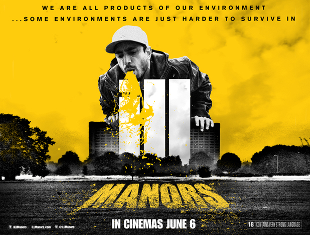
A typical code and convention that can be seen in this article is the use of a release date. This is significant as it is the one of the two pieces of text that is seen in this article. The lack of text on a poster is significant as it heightens how important the central image is and also acts as an enigma code getting the audience to think why is the character throwing up. This would get them to identify that it is because one of the key words in the title is "ILL" this gets the audience to question what the true narrative of the film would be about.
What design features help identify the Ill Manors brand?
The main feature that helps identify the Ill Manors Brand is the use of having the same font as every other platform. Furthermore, the use of a tag line at the top of the print suggests that it is a statement rather than an enigma code. In addition to this the fact that it says "Some environments are just harder to survive in" gets the audience to notice that Riz Ahmed is one of the main characters in the film who are struggling to 'survive' in their own environment.
What examples of synergy can you find with the broadcast platform or other print examples?
Synergy is shown through the use of Riz Ahmed. Riz Ahmed creates the synergy as he is seen on the Ill Manors Website as well as the fact that he is in more than one film which helps the audience identify him with his other productions. This is effective
No comments:
Post a Comment